


A number of companies in TheVentureCity Growth Accelerator program and venture portfolio are services with episodic usage. When we started working with them to figure out key growth metrics we realized a need to look beyond DAU/WAU/MAU.
This post presents some of our thinking and advice on how to think about growth if your customers come to your product on average once per quarter, per six months, or even once per year.
Monthly, weekly and daily active user metrics have become the de facto standard for measuring retention and engagement since they were introduced about ten years ago by Facebook. However, these metrics do not really work for businesses with episodic usage — ecommerce, travel, many SaaS services — the way they for the Facebook/Twitter/WhatsApp/Instagram use case, which is focused on daily usage.
We have come up with the following guidelines that we think can help product managers of services with episodic usage establish relevant growth metrics:
- Define the key action for your product. The key action signals that users of your product derive value from it. For most low-frequency services we are looking into right now, purchase is the ultimate key action that shows that the product is valuable and understood by its users. It might not be that straightforward in the case of services like Twitter, Facebook and others. In those cases, users extract value only once they put in sufficient effort into either publishing or adding friends.
- Define the frequency target for the key action. The best way to do this would be to define the offline analog for the action that you want the user to take and research how often the people do that in offline world. Here is Casey Winters who worked on growth for Pinterest and Grubhub: “For Grubhub it [the offline analog] was calling a restaurant on the phone and ordering food. People were doing it once or twice a month on average. So, we decided our frequency target should be monthly. For Pinterest, it was very similar: what is the offline action that Pinterest is replacing? The closest thing is browsing a magazine, which are monthly subscriptions. So, it’s probably a monthly thing here.”
- Examine customer retention using the frequency target. In case of AirBnB or Booking.com for example the majority of their customers book travel on average 1.5–2 times a year so the growth teams of those services not only look at monthly active users but also at six-month retention.
- Double check your intuition by looking at your most engaged users. How often do they come back? Is their usage frequency significantly different from that of the majority of “ordinary” users? If you see that 1% of your users come back for the key action every two weeks while the rest of the audience checks in once every six months then it might make sense to think about expanding into a portfolio of products catering to different types of users.
Once you are done with this exercise and feel that you have a good grasp on the frequency of use and retention patterns of your product the next step should be historical analysis and projection.
A good way to look at episodic engagement over time is to employ a rolling window. Rolling windows help us visualize monthly, half-year, or yearly trends on a daily basis. Thus, you don’t need to wait until the end of the month or longer to know how metrics are trending.
Rolling windows also help smooth out inherent noise. For example, a 28-day window removes day-of-the-week effects while approximating a month. Similarly, a 365-day window removes monthly seasonality effects. Comparisons of, say, engagement in a March-to-March window with a September-to-September window are relevant and meaningful.
To see a rolling 365-day (“L365”) window in action, we can use the example of a low-frequency marketplace with significant seasonality — a lot more people travel in summer so the service has higher transaction volume in the summer months. Active sellers are crucial for driving the growth of the marketplace so in this case, we are charting the rolling days active per seller in the year-long window; the metric is similar to DAU-YAU ratio, but multiplied by 365 to make it a little easier to interpret.
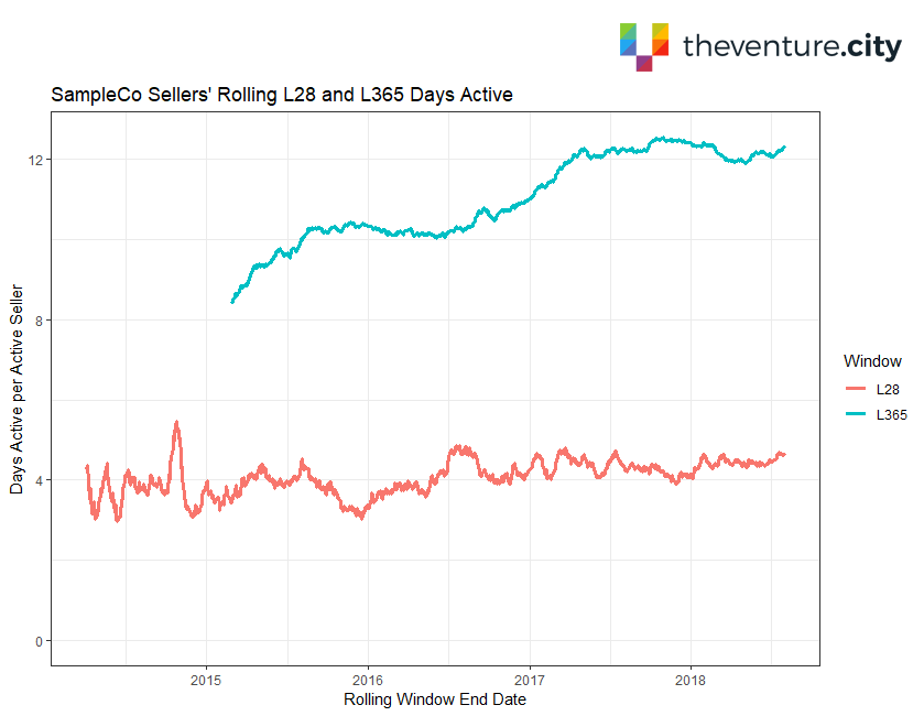
We can observe from the green L365 line on the chart that average seller engagement as measured by days active in a year mostly trended upward from about 8.2 in early 2015 to about 12.1 in April 2017. Since then, however, engagement has plateaued. Using the L365 window allows us to remove the seasonal noise and show the historical trend for annual seller activity over the last three years. The L28 window — the red line on the chart — shows no discernible change in engagement over time.
Seller engagement is crucial for marketplace survival so we need to understand what is causing the downturn. To uncover what might be causing the plateau, we can examine the same L365 window but break it out by seller segment. This chart does just that:
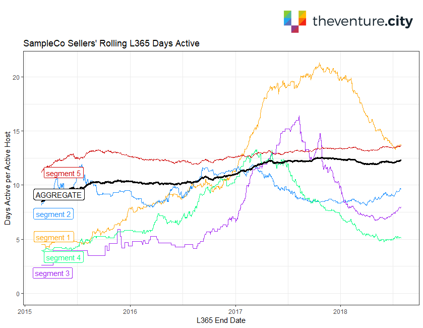
The green line from the previous chart repeats here as the bold, black “AGGREGATE” line. The relatively stable “segment 5” line is consistently around 12–13 days active in a year. However, the other segments show big run-ups followed by recent declines in engagement. Those segments previously drove the growth of aggregate engagement and are now causing the plateau.
The deep dive into the segment split provides actionable insights. SampleCo’s team now knows that in order to be able to restore seller engagement growth they need to investigate what might be causing the decline in the respective segments and start looking for the big changes either internally or externally that could have had a negative impact, especially around early 2018.
For sample R code that loops through a transaction data set and performs daily L365 calculations, visit GitHub here: https://github.com/dksmith01/TheVentureCity.
Comments and feedback are welcome!


.png)